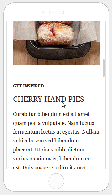
Often content in an email is organized in multiple columns. When viewed on a mobile device, those columns can become quite narrow and lead to a sub-optimal reading experience. In order to guarantee a better experience while reading emails on mobile devices, it generates HTML code that makes columns stack vertically. This way content is reorganized in a way that makes zooming unnecessary and is easy to scroll with a finger.
Sometimes you may want to make changes to the default mobile optimization settings that the our editor uses. There are plenty of different features you can use in order to do this. Let’s go over the different options that can impact the mobile version of your design.
Desktop vs Mobile Preview
Vertical stacking is supported by the most popular mobile email clients. In some cases, the desktop version will be displayed. This happens when a client lacks support for standard CSS.
One Size Doesn’t Fit All
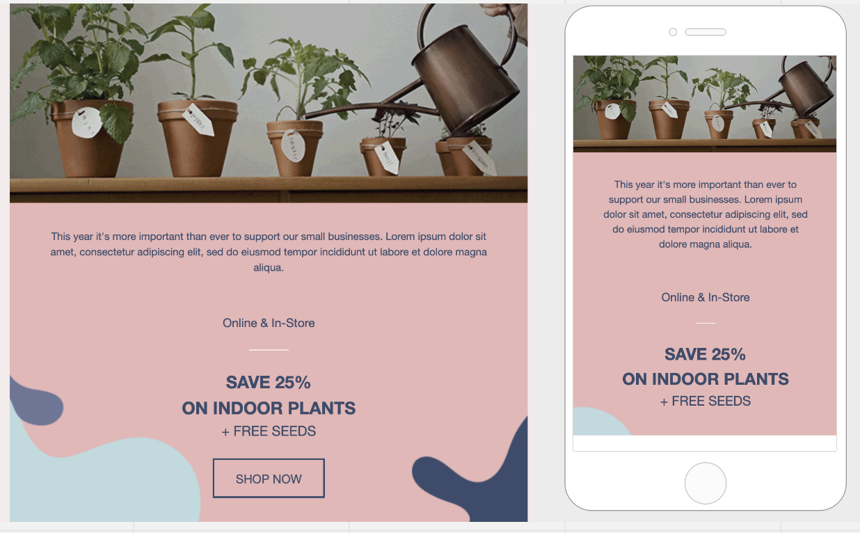
Although it normally helps, there are cases in which vertical stacking of columns may not lead to an optimal result.
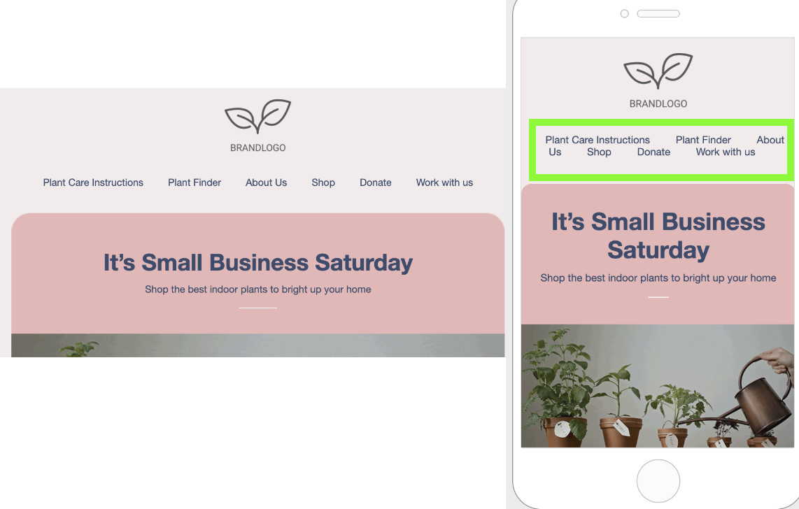
A common scenario is using a row to display a navigation bar with text links or icons. In that scenario, as shown below, a vertical layout could create excessive empty space, hiding important elements of the message or giving too much visibility at the top of the email to content that is not supposed to be that prominent.
Do not stack on mobile
The Do not stack on mobile row setting allows users of the BEE editor to decide when to override the default stacking behavior.
The option is available in the right panel as a row property, toggled off by default.
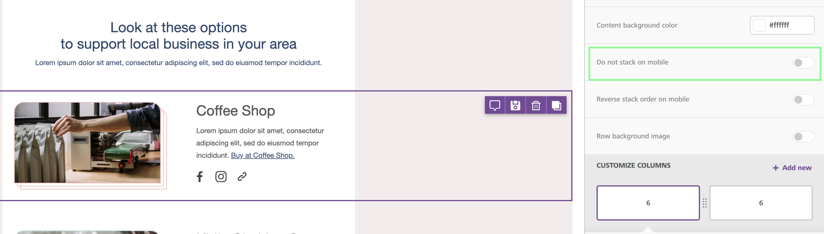
Email design best practices suggest a careful use of this display setting. A user-friendly vertical layout on mobile makes sense in most cases. As always, it is up to you and your creativity when and how to use this option.
Reverse stack on mobile (New!)
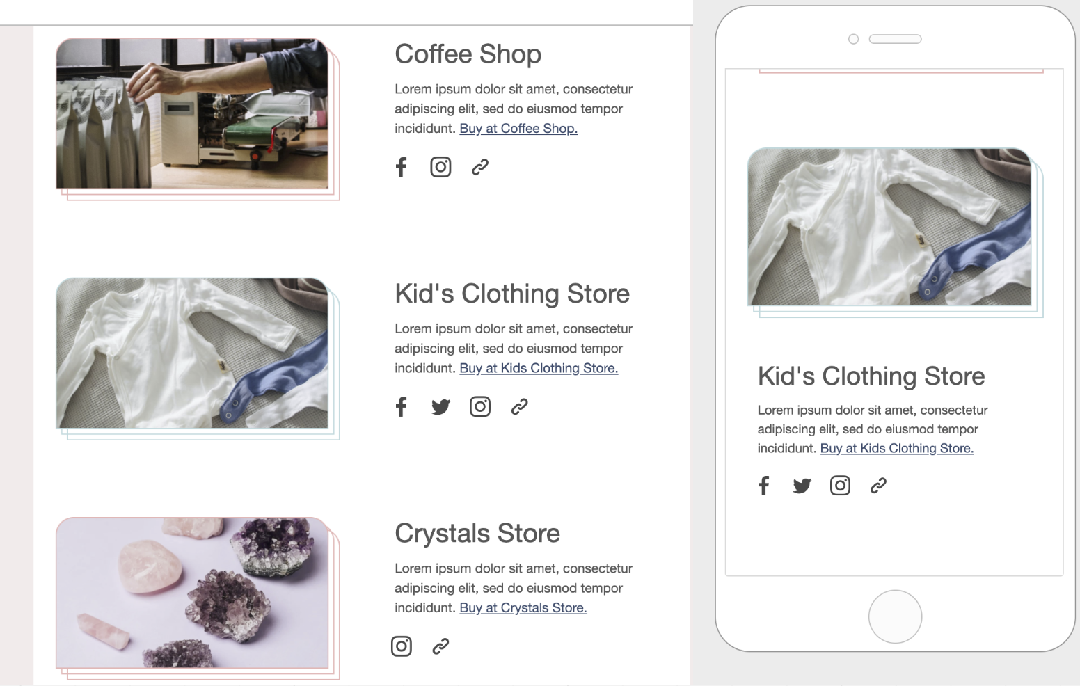
In some cases, the columns stacked on mobile can work better in a reversed order.
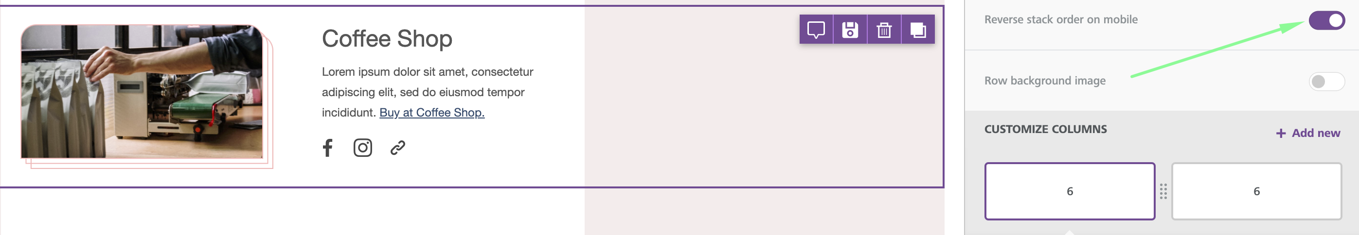
Here is an example from a Template:
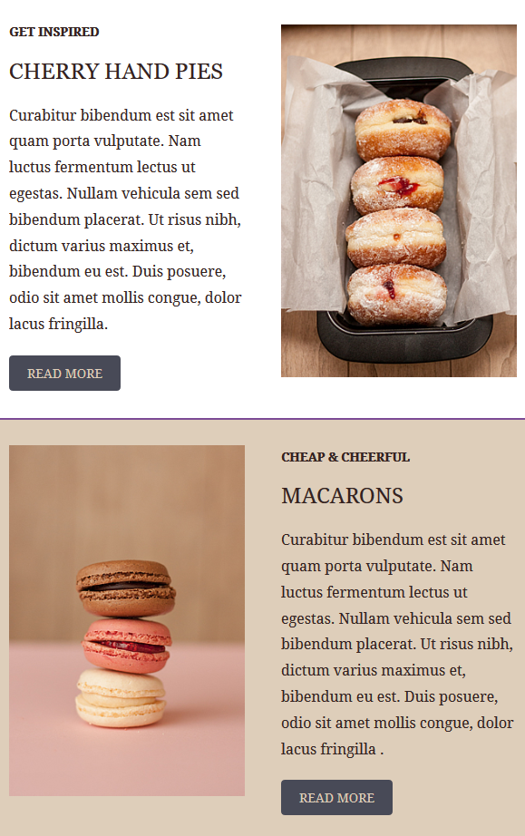
The same template also has a section where images are aligned on the right
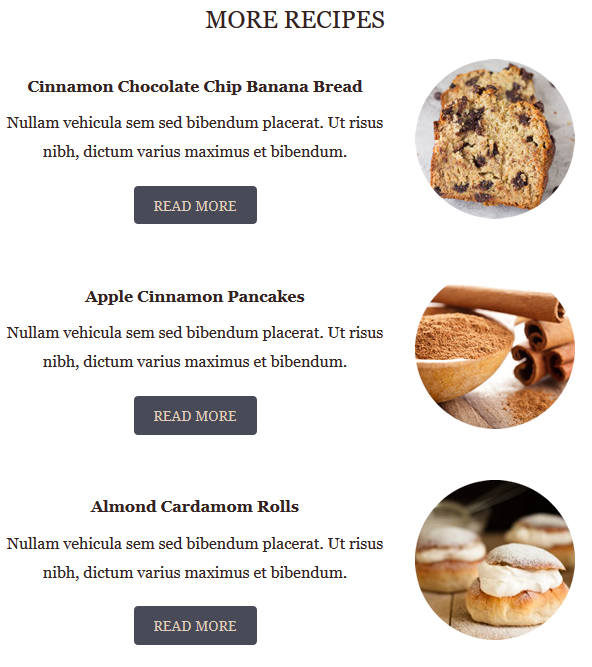
This is how these two sections render on mobile by default.
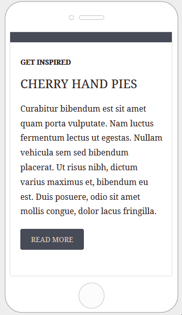
Here is how the email layout renders when columns are stacked in reverse order.
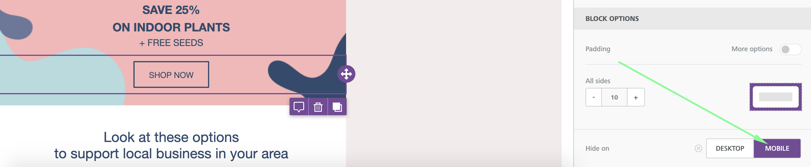
Hide Content on desktop/mobile
All content blocks in the editor include a Hide on setting in the property panel. To use it, scroll down until you see the Block options section.
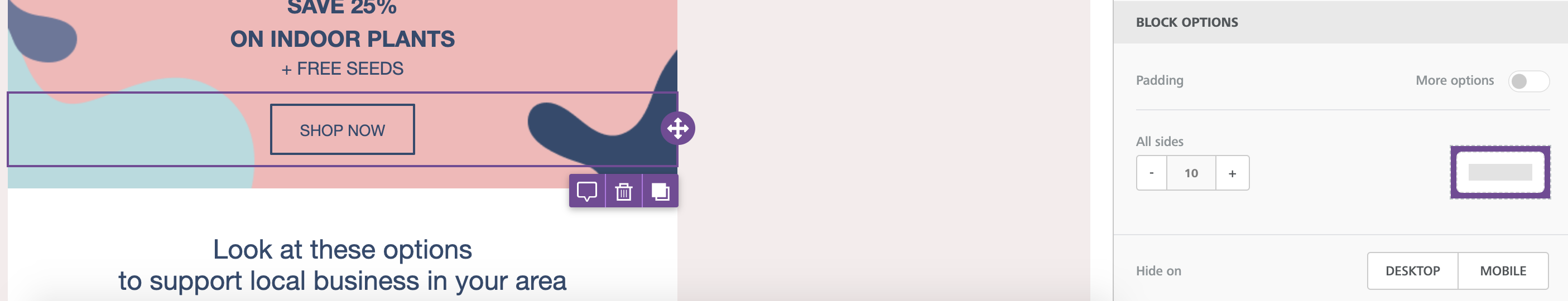
You can check the result by going into the Preview and selecting the Mobile view. You will see that the content blocks for which Hide on has been turned on will not be visible.
Thanks to this useful new feature, we can now build a message that has an optimized layout for desktop! We can also provide a better viewing experience when opened the message is viewed on mobile devices.